Monday 24 February 2014

Edmundo Sanz Gadea


Edmundo Sanz Gadea is a Spanish artist based in Madrid. He bag working in advertising in 1988 as an illustrator and art director before developing his career design agencies, Direct Marketing and Advertising as a creative art director. This involved creating and developing direct marketing campaigns, brochures and graphic designs. Currently, he only uses the method of painting in his work.

http://d3oeu2l8qd7s1b.cloudfront.net/414389-10786185-7.jpg

NY Skyline Attack Before (created April 19th 2012)    Mediums: Oil on board      Size: 31.5 x 48 x 1.6 in

This piece is described as being ‘Abstract expressionism artwork representing the skyline of the city before the brutal attack of 11S 2009’. (http://www.saatchiart.com/art/Painting-NY-SKYLINE-ATTACK-BEFORE/414389/1556904/view)

This piece is an expressive piece that looks quite archaic because the colours used are quite dark and brown-toned. The silhouette of New York is situated slightly to the right of the piece and has been painted in shades of black, blue and grey which looks quite abrupt against the soft looking background. There is a lack of bold lines; however, the black around the buildings makes them look more prominent. Below this is a subtle reflection of what can be seen above which gives the look of the city floating on water. The sombre colour scheme may be to represent the artists feeling toward the event, which would obviously be very negative because it was so traumatic. It appears that the background colours have been applied to the board using a sponge as they look very soft and faded.


http://d3oeu2l8qd7s1b.cloudfront.net/414389-10786035-7.jpg


Metropolis Building (Madrid)        Medium: Oil on canvas         Size: 59.1 X 39.4 X 1.6 in

This is a city view of the Metropolis building in Madrid which is described as being one of the most significant and photographed buildings in the capital city. It has been painted in an array of shades of white, blue, grey and black, with the lettering being painted in a vibrant yellow colour. The background looks like a series of subtle squares have been painted so as to represent the buildings surrounding the Metropolis. The tone on the building has been picked out with a light blue and a pale grey which clearly looks more subtle than black and white. In the bottom left corner, it looks as though black paint has been splattered using a paintbrush in order to replicate a bush nearby.

This artist’s work is very different to my first artist as he is more expressive and pays less attention to absolute detail.  He also uses paint, rather than a pen or pencil, however, he sticks with the theme of building and architecture. The second piece fits perfectly with my theme as the building has lettering on it.

Sunday 23 February 2014

Photographs (Continued)

Some photographs I have taken over the holidays of things that relate to my theme.


Friday 14 February 2014

Observational Drawings

Below are some observational drawings I have done of some objects that relate to my theme of 'Buildings with Lettering'. Some of the objects have textures similar to buildings, whereas others are of lettering that I have tried to replicate.


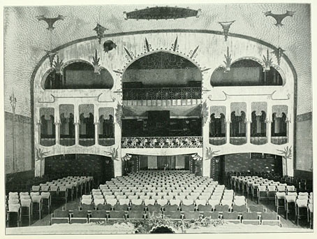
Artist Research - August Endell


August Endell

I found this artist/architect in a book about architecture in the library at college.


Photograph of the Buntes Theatre, Berlin.


August Endell was an architect born in Berlin, Germany in 1871. He was a self-taught architect. He is known for being one of the founders of the Jugenstil movement, which is the expressive movement in Art Nouveau. He is famous for many of his designs, including the Atelier Elvira Photographic studio in Munich, the Buntes Theatre in Berlin (1901) and Hackesche Höfe. In the book that I found, I came across his design for the Buntes Theatre. The theatre has now been destroyed, however, Endell designed the decorative elements of the buildings and used a diverse colour palette, which links to the name of the building, as 'Bunte' means coloured.

Artist Research - Banksy


Bansky is a very famous graffiti street-artist based in Bristol, England. His birth name or date of birth is not known to the public. His work combines dark humour with politics and graffiti created using a very unique stencilling technique and his work is features on walls, bridges and streets all over the world. He started off as a butcher, however became interested in graffiti during the ‘great Bristol aerosol boom’ in the 80’s. He was inspired by an artist called 3D who later went on to be a founding member of Massive Attack, a music group. Banksy is well known for disagreeing with the idea from the government that graffiti art is vandalism and tends to display his work on extremely public surfaces.

http://www.ufunk.net/wp-content/uploads/2010/08/banksy-lies-politics-550x675.jpg

This piece by Banksy was painted using spray paint and stencil onto a public wall. At the top, bold black lettering spells out the phrase ‘If you repeat a lie often enough, it becomes the truth’. Below this is a picture of a young girl in black and white who has crossed out the word ‘truth’ and has written ‘politics’ underneath in red. Bansky has obviously made this piece as controversial and as provocative as possible. Underneath the text and image of the young girl, white graffiti can be seen which gives the piece more depth and texture.


https://blogger.googleusercontent.com/img/b/R29vZ2xl/AVvXsEjs12wI8zF6G4PP9uLzReyi95fijBSrFmrT2Cpwy5LpdU_OiN8A9o2STf8MHegjYSvbHnDEXmFiOBX3MbWKsCd433gYfHd3y9EHQjeMVLtYD81pDEOguOx9SvD0nnocAgpEs7wGvo9ka30/s1600/BanksyNoFuture.jpg

This piece shows another young girl, this time sat at the bottom of the wall. She is holding a balloon which is actually the O in the text on the image which says ‘No Future’. Again, this piece is controversial and provocative as the text is quite negative and pessimistic and people tend to want to look on the brighter side of life. Underneath the main image and lettering, chipped paint and older graffiti can be seen which gives it more depth and makes it look more old. The picture of the girl is quite obviously stencilled on and the lines are quite bold and uniform, not like it was a spontaneous painting.

 
 have chosen to look at Banksy because he paints on buildings, which links to my theme of ‘buildings with lettering’ in a more out-of-the-box way. I also like how the colours used on most of his pieces are very limited; he usually sticks to black, white and red. This could be to reflect the seriousness behind the messages in the individual pieces.

Tuesday 11 February 2014

Artist Research - Stephen Wiltshire


Stephen Wiltshire is a British artist born in London on 24th April 1974. At the age of three, he was diagnosed with a form of autism. As a child, he was a mute and found it very difficult to relate to other people. When he turned five years old, he was sent to Queensmill School in London where it became obvious that he had a flair for drawing. He studied fine art at City and Guilds Art College.

Wiltshire specialises in landscape drawings, particularly cityscapes. He is well-known for being able to draw extremely detailed landscape from memory, sometimes after only seeing the landscape once for a brief time. In 2006, he was awarded an MBE for his services to art and since has opened up his own gallery.

Manhattan skyline from the Intercontinental Hotel - drawings and paintings by Stephen Wiltshire MBE

Manhattan Skyline from The Intercontinental Hotel   Medium: Pen and ink   Size: 420 X  297mm (A3)

This piece is a very detailed landscape of Manhattan, drawn in black pen and ink. The drawing features buildings of different sizes, shapes and architectural styles (some modern, some a lot older). Wiltshire has used a variety of lines in different sizes and pressures in order to replicate the view from his hotel room and add tone to the sketch, making it look less flat. As some of the lines used are quite angular, the piece looks very 3D and realistic. The contrast between the lightest colours and the darkest colours are quite abrupt, particularly around the edges of the buildings which makes the silhouettes of each building look more prominent against the sky.


Street scene of 34th street New York - drawings and paintings by Stephen Wiltshire MBE

Street Scene of 34th Street New York      Mediums: Pen and Ink       Size: 210 X 297 MM (A4)

This piece is a very detailed sketch of a street in New York. In the picture you can see various skyscraper style buildings and an array of vehicles. It was drawn from eye level and the buildings are drawn at an angle, giving the piece depth. Again, pen and ink has been used to give tone and to recreate each tiny detail perfectly. Wiltshire has used thin marks to create the illusion of movement with the cars and to show tone.

Both of these pieces relate to my exam work as they are architectural sketches and therefore, focus around buildings (my theme being buildings with lettering). On the second image in particular, some lettering is visible.

Thursday 6 February 2014

Buildings with Lettering (Photographs)

A series of photographs taken in preperation for my AS exam. I have chosen 'Buildings with Lettering' as my starting point.